Tag Archives: review

DeLonghi Alicia espresso maker

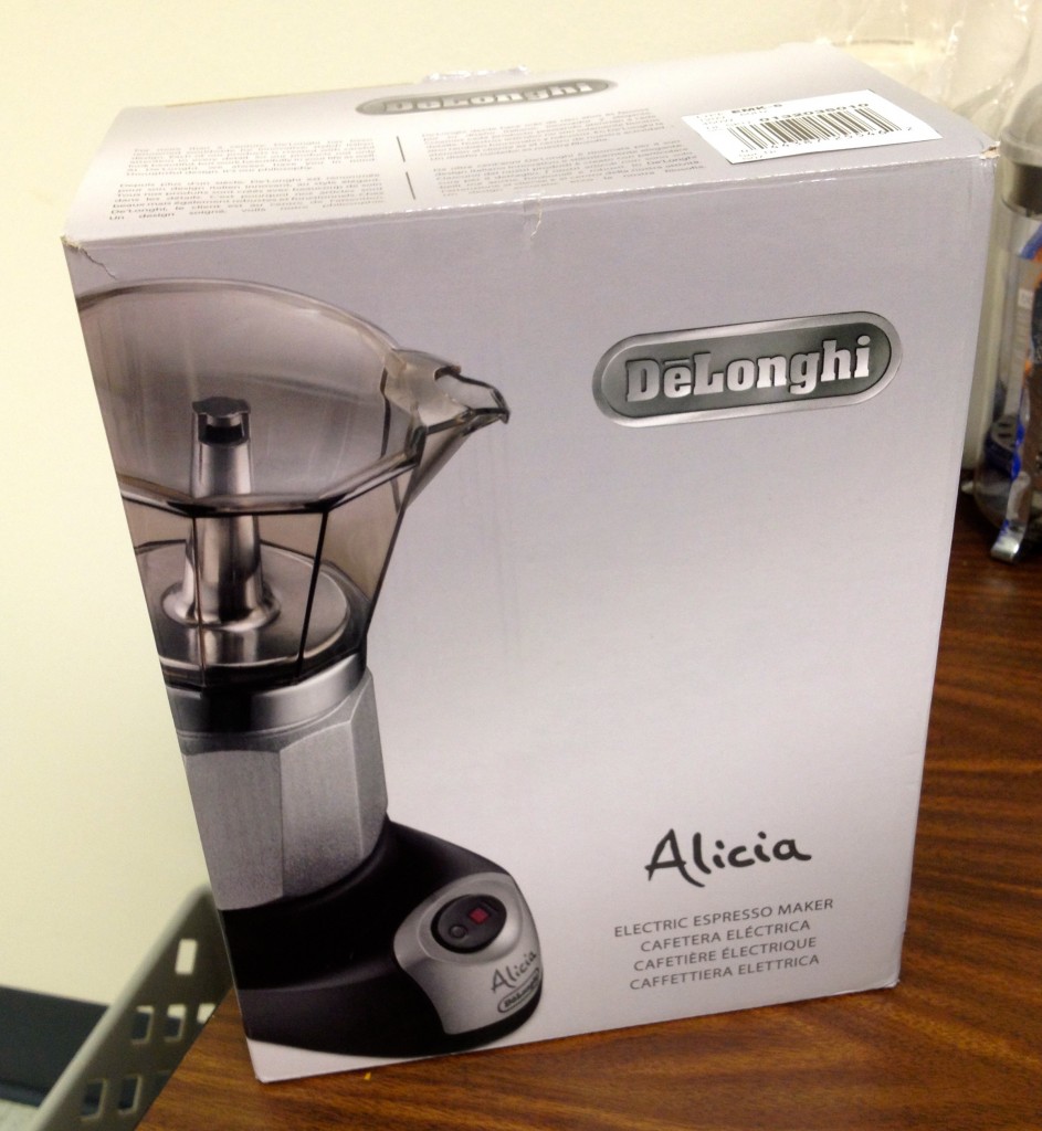
When I got back home last Thursday, I found this at the door:

A DeLonghi Alicia electric espresso maker!

As you can see, it looks like a regular old school stove-top espresso maker. But this one uses electricity instead of a stove, making it viable for office use! I first learned about it in Amanda’s blog so I added it to The MKX® Wish List on a whim (readers: it’s not too late to buy me a birthday present). Turns out a reader got it for me 🙂

It’s three main pieces. The left-most thing is what replaces the stove. The pitcher itself is clear which is cool because watching espresso brew is cool. So what.

Everything is standard. You add the coffee, you screw everything together. You push the button and wait. I’m just posting the photos because they look neat, not because they are all that informative.

The brewing process is short. The coffee comes out tasting great and the whole thing is easy to clean. It makes enough for maybe 3 cups of espresso. For the price I think it’s a worthy investment. If you buy one, maybe you can use the link below so that I get a tiny referral bonus?

Recommendation: If you work at an office and hate office coffee, buy this. It works really well and it only costs about 20 Starbucks espresso shots.

Mini Lion Review

Because you asked for it, here it is: a few notes on the new Mac OS X. But I must clarify that I have not used it that much yet.

First, some quick observations:

  • Since I don’t have a multitouch trackpad on my old Mac, the new subtler scroll bars don’t disappear. This is good. Scroll bars serve a purpose: They tell you if there is more content in the window and how much content you can see at once. I want to be able to glance at them without needing to attempt to scroll.
  • Not having a multitouch trackpad has disadvantages: No cool gestures for Mission Control, Launchpad, etc. I’m missing out.
  • Oh yeah, Mission Control is great, and Launchpad might be useful.
  • The new Mail.app is cool and I really really like the way they did threaded messages.
  • They reversed the scrolling behavior: Move fingers up, and the content moves up, like on the iPad. This seems like the right thing to me but it’s going to take some time to get used to. I will try to without going crazy. Those of you who aren’t as patient can toggle the behavior in the System Preferences.
  • I really like full screen apps except for the fact that the menu bar hides until you hover. It’s not that I need to see the menu bar, but rather that when I move the mouse up to push some button or select the URL bar in Safari, the menu bar pops down and pushes down whatever I’m trying to click on. It’s driving me crazy. Breaks Fitt’s Law too.
  • AirDrop does not work on my computer. I don’t know the details on how it’s implemented nor why they couldn’t make it work on my computer… but my hardware does not support it.

The lesson so far: Time for me to get a new Mac.

But here’s what I think is the most significant and profound change in Mac OS X 10.7 Lion – and it happens to be the one thing that you won’t use immediately because it requires third party application updates: Auto Save and Versions and Resume.

It’s a big deal: Apple went back and questioned one of the most basic givens of computer use since the 80’s, the stuff nobody even questions anymore. From now on, you no longer do we need to save your files. It happens automatically, and you can always go back and revert any change. It’s built-in and transparent and easy to use. It’s great.

And they didn’t stop there. Quitting applications is now obsolete! But if you do quit, when you restart the application or even your computer, everything comes back just the way you left it (and you didn’t have to save your open files!).

Maybe it doesn’t sound like much, but it is a is a change to a basic paradigm on our interaction with our computers (Ah! but not our iPhones and iPads). File managing and file systems are going away, and that’s a good thing.

Overall I really like Lion, it feels as fast if not faster than Snow Leopard (YMMV), and it’s very well worth a paltry $29. So download your copy now!

iPad 2 mini-review

I have now spent a few days with my precious iPad 2 and have collected a few thoughts. Keep in mind that these are based on my very positive experience with the original iPad; and is not meant as a thorough review of the iPad 2. If you are one of those poor lost souls still trying to figure out the answer to “Why should I get an iPad?” then you need to seek help elsewhere.

Size and weight

They made it considerably thinner and a little lighter. Lightness and thinness are things you can never have enough of in a gadget such as this. You can really feel the difference  while holding it and it’s nice.

Cameras

Most reviewers complaining about the low quality back-side camera (good for HD video but not good for still photos) are missing the point: Nobody will ever hold up an iPad (nor any other tablet) to use it as a camera – even if it had DSLR-like quality. It’s so uncomfortable and so awkward. My take is that since every iPad knockoff added a back-side camera, Apple had to do it in the iPad 2. If you want to take photos or videos, use a real camera or your iPhone 4.

The front-camera is perfectly adequate for FaceTime video conferencing although I seem to keep blocking it with my hands.

Speed

It was very rare for the iPad 1 to ever feel slow, so for the most part the iPad 2 does not make a huge difference. But for those things in which the iPad 1 felt slow you can really really tell the difference. Web browsing is one good example of this. Facebook feels waaaay faster and this sentence alone will be enough to make several people upgrade.

Smart cover

The smart cover is slick as hell. See the video if you haven’t. As a stand it’s much better than the old Apple case. The big caveat: It doesn’t protect the back of the iPad. I personally don’t want this thing to get all scratched from tossing it on hard surfaces. I will be getting a case once I find a decent one. In the meantime I’ve settled on a cheap temporary solution. More on that in a future post.

Other

Battery life is still excellent. The screen is exactly the same – but the stupid Internet has planted dreams of Retina iPad displays in my brain: I can’t wait. The lock and volume buttons are all harder to reach when the iPad is on a table because they are tilted to the back. But the case locks it so I rarely need to press that one. The docking cable protrudes strangely. The speaker sounds about the same.

The original iPad substituted 90% of my home computer use. It was also a great book reader and a joy to travel with; and the ultimate toilet companion. For those reasons I was willing (aching) to upgrade: I use it so much that any improvement on the experience is worth it to me. Highly recommended.

A good iPad bag

I was looking for a while for a good travel bag to use with my iPad. I wanted something with the following characteristics:

  • Fits the iPad while inside the Apple case, the charger and cable, and just a bit of extra room for things like tickets and passport. But not much else. Small as possible.
  • Has a shoulder strap.
  • Does not look like a purse.

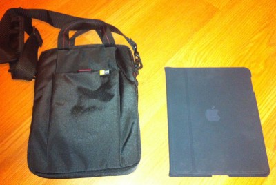
I found this cheap Case Logic bag: The BUA-10 7-10″ Netbook / iPad Attaché. While it’s not really designed for the iPad (it’s about 2 centimeters too long), it happens to be almost perfect.

BUA-10 Case Logic bag and my iPad

It has a little front pocket, and inside there is a business card holder, a pen holder, and another small pocket.

To be honest, the build quality of the bag could be better, but for $20 I’m not going to complain much. Recommended. But if you want something nice, this Targus bag (which is not out yet) is more expensive but looks good.

Front pocket. The velcro does not inspire much confidence. I wish the front pocket was a little roomier and had a zipper.
Credit card holder, a small pocket, and a pen holder. You can also stuff a magazine inside the case, with your iPad. But only barely.

John Siracusa reviews Mac OS X 10.6

snow_leopard_ars-thumb-640xauto-8029Every time there is a new major Mac OS X release, John Siracusa of the excellent technology website Ars Technica releases a long and detailed review. And the one for Mac OS X 10.6 Snow Leopard one has arrived. I post about it here because I think a del.icio.us link on the sidebar is not enough.

John Siracusa has been writing these reviews since Mac OS X DP2 (December 1999) and they are excellent, offering a well written detailed view into the internals and externals of Mac OS X. For me it’s a fascinating read. For you, I don’t know… this is probably attractive only for the technical mind. Mom, don’t read this.

Quick review: X-Men Origins: Wolverine

wolverine14

I got to see X-Men Origins: Wolverine on Sunday night. This is my quick review. But before you read, consider this: I was an avid comic book reader as a kid. I generally like action, science fiction and superhero movies. I liked all the X-Men movies.

Now with all this said, let me tell you that X-Men Origins: Wolverine is terrible. Read on for a rant with a few mild spoilers.

Continue reading Quick review: X-Men Origins: Wolverine

I watched the Watchmen

watchmenposter

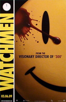
On a whim I decided to attend the Watchmen movie premiere last night. I read the re-print of the original 1986 graphic novel a few months ago and it’s great; it’s even listed as one of Time Magazine‘s best 100 novels of all time.

This is not your usual superhero movie based on a comic book character such as Superman, Spider-Man, or the X-Men. No, this is a self contained story with all original charaters. No prequels, no sequels, no series. Just Watchmen. The book’s plot is quite complicated and definitely not kid-friendly. You shouldn’t be fooled by the superhero premise nor by the hand-drawn presentation: Watchmen is for adults.

Continue reading I watched the Watchmen